Friday, December 21, 2012

Scribbles For The Holidays


Hey everyone!

Well, it appears the holidays are upon us! My family and I are heading out to St. Louis tomorrow to spend Christmas with my family but I wanted to try and get one more post in before hitting the old dusty trail. 

Nothing too spectacular but I'm unloading some of my recent scribbles from my sketchbook. If you follow me on Facebook or Twitter some of these might seem old but there are bound to be some bits in there I haven't posted elsewhere. Also, I hope you guys like the roughness of these posts. I'm not trying to cover anything up. I mess around a lot and not everything looks as nice but I enjoy seeing the mess among the successes. :o) I hope you do too!

Hope you all have a safe and amazing holiday with your loved ones! Go forth and be awesome out there in the new year ahead! Ha!

- Ryan

Sunday, December 09, 2012

Von Kaiser Sketch


Hey there blog faithful!

It's been nearly a month since my last update but I just wanted to let you know that I'm alive! We've had a lot of people visiting us in Chicago this last month or two and I've struggled to get back into a regular working rhythm with the kiddo. But I'm gonna keep pushin'! The weeks leading up to the holiday will surely be busy but I'll make sure to drop more art on your before the year ends. And you can always find out the latest goings on with me by liking me "Art of" page on Facebook for following me on Twitter.

I have some other stuff I could show but I figure I'll hold onto that for a more sizable update. Until then I hope you enjoy this random paint scribble I've been picking at! I've always been a huge Punch Out fan and I thought that one of the recent heads I drew in my sketchbook looked a like like Von Kaiser. I was looking for something random to pain and that's where this fella came in! I feel like I should probably get back to work on more important things but I still might pick at this guy a bit more over the next couple weeks. He's been a lot of fun to noodle around on.

Hope you guys are staying warm and enjoying the holiday season! Take care and keep being awesome!

- Ryan

Monday, November 12, 2012

Scribbles 'n Scratches


Hey guys! I've got lots of scraps for this update so I'll keep it brief starting out with this random old lady sketch. And her creeper dog too. ;o)


I missed self portrait day again last week since I was on the road to St. Louis, MO. I doodled a few portraits of myself and the one the lower right hand corner is by the talented Enrique Rivera.


During renders at work, where a lot of my scrawling happens, I managed a couple sketches of Link. Enrique, again, showed off his inking expertise with the one of the right. He always finds a way to make my craptastic sketches look awesome! I wish I was a fraction as good with a brush full of ink!


Random doodles. Kinda playing around with not caring as much about creating a rendered, fleshed out piece lately. Just kind of having fun jotting information down.


These next few I've debated sharing but I don't know what it hurts. Earlier this year I started writing a story that could perhaps be a graphic novel of sorts. I have a fair bit of work done on it but I've not really drawn much for it just yet. I took some time in recent weeks to doodle out the main character. I'd drawn him a ton but could never hit the design. The guy in the lower right is where I finally hit the nail on the head. Meet Aldric! At least I think his name will be Aldric. Ha!


I also have had these snippets in my head of pivotal scenes and landscapes. I took some time to scribble some of them out. Lots of work to do if I ever plan on seriously accomplishing this stuff.


And I figured I'd toss out another update on my dwarf image that I haven't touched in over a week. Ha! Still a long ways to go but he's definitely moving along! Hope you guys like how everything's turning out! Sorry for missing last week but I was out of town. I'll try not to make that a habit! Thanks for checking in! Go forth and continue being awesome!

- Ryan

Monday, October 29, 2012

Happy Dwarfin' Halloween!


Hey everyone! Thanks for checking out my blog again this week. I'm going out of town next weekend so I'm holding back some of this week's scribbles in the hopes that I'll get more work done in my sketchbook while away. Then I can have a healthy drop once I return back from St. Louis, MO. That doesn't mean I don't have anything for ya though!

The first is a themed INKtober doodle that I splashed some color on. Halloween is one of my favorite times of the year. Mostly because of the candy! But if you've followed this blog long enough you'll know that I like drawing monsters and critters of all sorts. And Halloween is just full of 'em!  So I hope you enjoy this candy lovin' zombie in honor of this festival of creepery!

The next couple pics are of something I've been kicking around when I've had some free time this week (which hasn't been much). I really liked the dwarf sketch I did last weekend so I wanted to try and get the guy painted up. Any excuse to paint dwarves is a win in my book. :) You guys have seen my process in the Red Baron piece and I'm doing more of that sort of stuff here. The colors will shift and change as I go but it's shapin' up. I like to keep it pretty loose at this phase and really enjoy the process of letting the piece evolve. I think this might be a nice one and I can't wait to see where it takes me.

Hope you all have a great Halloween! Be safe out there and I'll see ya in November!

- Ryan

Sunday, October 21, 2012

Bits and Blops


Hey gang! I always hate it when people call people "gang"so I figured I'd try it out and see how you all like it! 

Regardless, I have another scribble filled update for you wonderful people this week! I've been spending a bit of time in my sketchbook exploring techniques and working on a potential story. So most of what I've been doing has been pretty messy. These were the only bright spots and as usual they aren't all that bright! Ha! I hope you enjoy them just the same.

I'm still fumbling around with ink due to the awesomeness that is INKtober. On the first image you'll notice that the middle head was inked by my good buddy, Enrique Rivera. He's trying to help me get my mind wrapped around this hole ink thing. I'm pretty terrible at it!

And I'm quite fond of the little dwarf that managed to fall out on my way to bed one night. I think I might even correct some some of the issues with the sketch in Photoshop and pain this fella up. Stay tuned!

Thanks for stopping by and looking and my scribbles! Send me messages on Facebook and Twitter and make me feel bad for not drawing more during the week! I need more guilt driven sketchbook sessions. Ha! Take care guys! See ya next week!

- Ryan

Sunday, October 14, 2012

Super Mario Death Dealer


Hey people! Just a quick little update tonight after a busy week at work and with the baby. Jobs and two month old people can be a lot of work! Who knew?! Ha! 

The first image is a potential t-shirt design I submitted recently. I'm hoping it gets picked up because I think it's a pretty fun little design. Really wish I could of used a few more colors in there but limiting your palette in this way is quite a fun exercise. Fun but also challenging! I would of liked to use a couple more in there to round it out but I was pushing my limits. I'll be sure to post an update if this guy ever makes it print!

The second couple posts are just some snapshots of some of the doodles I've done recently in my smaller sketchbook. Still working in Ink in honor of Inktober and trying to get a little Halloween themed in some of them as well. Hope you like 'em!

See you guys next week! If you're lonely don't forget you can follow me on Facebook and Twitter via the links at the top of my blog! Thanks for checking out my stuff! Keep being awesome!

- Ryan

Monday, October 08, 2012

INKtober


You've heard of Septembeard, right? Well right after you're done shaving off that beautiful chin mane get ready for a little something I've learned from the internets called INKtober! That's right! All month long tons of illustrators dig in and try to leave the digital tools behind and post artwork in ink as the bearded gods intended it. On second thought, don't shave that beard or you'll anger those gods. Ha!

I've seen a lot of people posting stuff but what really got me in the mood was the awesome daily inks that Jake Parker has been dishin' up on his blog. Seriously inspiring stuff that evokes feelings of a Miyazaki film. Love 'em, Jake!

So I decided I'd venture out of my comfort zone and try to do at least one piece in honor of this sacred month of ink blots and brush pens. And it gave me a good excuse to draw a dwarf wielding an axe. I'm always up for that! I hope you like him! I had fun even though I'm not all that great with inks. I might even do a few more as the month goes on so stay tuned and keep being awesome! See ya next weekend!

- Ryan

PS: GO CARDS! :o) Love me some postseason baseball!

Friday, September 28, 2012

Slots!


Hey guys! Thanks for checking back to see what sort of art offerings I'm making to the altar of the internet this week!

This time around I figured I'd share a bit more of what I've been doing at my day job. I've already explained in an earlier post that I worked in video games primarily for about 4 years before stumbling into the world of slot gaming. It's not a sort of job many artists imagine themselves doing when they escape the clutches of college but it's treated me well over the last couple years. I've met a ton of talented people and have found my illustration/design skills being refined by the demands of the industry.

I don't share a lot of what I do online because the audience for slots and the sort of artwork I normally create for myself don't seem to go hand in hand. But lately I'm finding that bits of my personal work is starting to come through in some of my games. And I just wanted to share since it's what I spend the bulk of my time doing!

This next week is our annual slot expo and our company is debuting a ton of new titles. A few of which, art wise, were created by your's truly! They've been hitting the marketing bandwagon and one of these is already in casinos so I feel it's ok to share. If you do find yourself in a casino then drop some coins into "Fire Queen" and "Giant's Gold!" And be on the lookout next week when I post some of the art I did for a couple other games that will be featured at the show! It's a bit different then the normal work that I do for fun but I'm quite proud of how they've turned out.

Hope you like 'em! Until next time... go forth and be awesome!

Ryan

Sunday, September 23, 2012

Noodles


I had anticipated that I'd do a ton more drawing this week but it didn't really happen. We've been pushing really hard at work as we have our yearly trade show just on the horizon. So most of what I've managed to get out is more noodle-y and loose then I'd like. Here are a some of the more interesting scraps from the stuff I did here and there in meetings and so on. I hope you enjoy 'em regardless of how crude they are. Ha! Thanks again for stopping in and stay tuned to see what else falls out of my pencil next weekend!

Ryan

PS: You can always follow me on Facebook and Twitter! Come say hello and keep me company on the interwebz!

Monday, September 17, 2012

That's Nuts!


Hey guys and gals! I'm a little late with this weekend's blog post so I apologies for that mess. It's been a busy week but I managed to get some scribblin' in. Sadly, I'm saving most of my sketchbook pages for next week's update. You can see sneak peeks of my scribbles if you like my page on Facebook for follow me on Twitter. If you don't then you'll just have to wait until next weekend! Muwahaha!

I will, however, share with you a couple photos that I put on my Facebook page several days ago. As I mentioned in an earlier post, my daughter was born last month and I really wanted to do some pieces for her bedroom. My wife themed it with woodland creatures so I'm working up this squirrel drawing to go in her room first. I'm trying a bit of a new process and it's moving along relatively smooth for the most part. I just need to park my butt in a chair and finish it off! Hopefully I'll have it all wrapped up next weekend. Should look sharp framed, I hope. What do you guys think?

That's all I've got for now but I'll you can find me sputtering words all over the rest of the interwebz. Come find me! Ha! Go forth and be awesome, guys!

Ryan

Things I'm Loving Right Now: (Been a while since one of these, right?!)

My new baby daughter, Callie - Daaawwwww!!! ;o)

Apple Products - When do I not love anything from my favorite cult? My iPhone 5 should be here Friday and I finally picked up an Apple TV last weekend. Lovin' it!

Full Metal Alchemist: Brotherhood - Speaking of Apple TV I noticed that Hulu now has this series in its entirety so I've decided to make my way through the second half. Really enjoying is so far. Looking forward to finding more new, cool shows.

Nintendo - I've been geeking out over my 3DS XL for the last couple weeks. I'm loving the new design. And I've got my deluxe Wii U on preorder! Can't wait for this Christmas! Ha! I feel like I'm 12 again!

Friday, September 07, 2012

The Red Baron


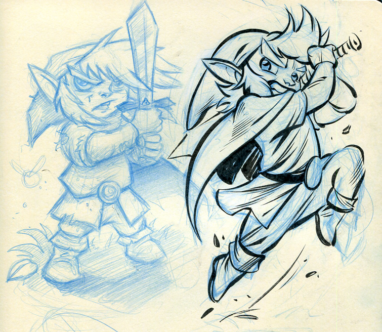
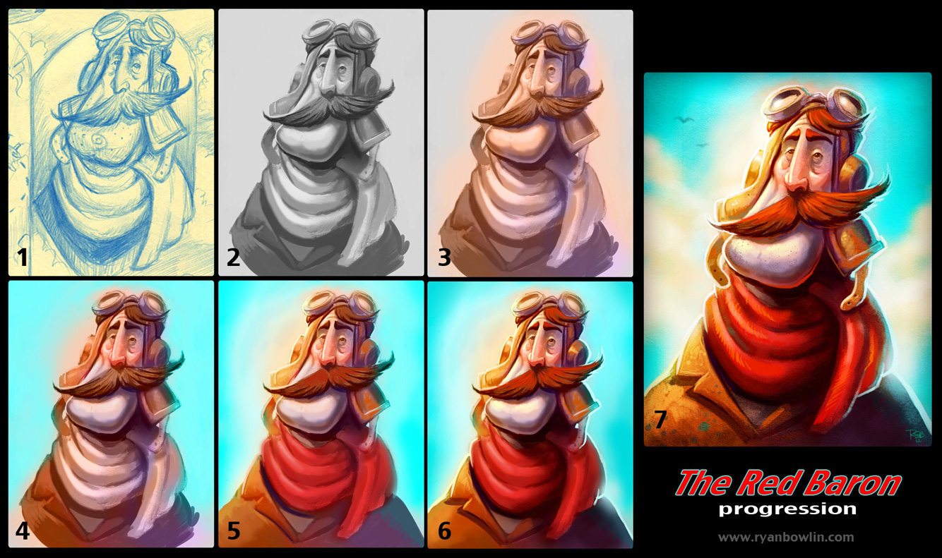
Hello everyone! Welcome to this weekend's update! I've got a small treat for you guys this weekend! I actually painted something! Ha! I took one of the Red Baron scribbles from last week's update and rendered him up a bit. It's pretty loose and sketchy... but still! Color!

Every so often I get asked about my process and how I go about handling the digital painting medium. The truth is that I don't really follow a rigid process of steps to get things from one end to the other. It's more like building something up from nothing and letting the piece evolve as I make design decisions regarding shapes, colors, etc. As corny as it sounds the piece will speak to you and tell you what it needs as your knowledge of anatomy, color theory and design grows. But for now I'll try and strip it down a bit to help you digest how I roll through a simple painting. You can follow along using the image above.

One

I pretty much always start with a sketch that I've scanned in from a sketchbook or something. I don't own a Cintiq and my skills drawing with a tablet just aren't there. It still feels more natural and I get the best results when I sketch with good ol' pencil and paper. There's just an energy there that I can't seem to get when I switch to digital.

This step is pretty simple since I've done most of the work previously. But I'll discuss a bit of my head space when I'm sketching. When I'm drawing for myself and just havin' a great time I tend to focus on design more the anatomy or anything. I like to just look for shapes and then add more and more shapes until I have something that looks appealing or has some character. It's one part of the process I've fallen in love with. I often draw a random shape and then try to make some sort of interesting character out of it. I wouldn't often draw a rectangle for a head but sometimes I try to just to get myself thinking out of the box (no pun intended). Some of my best, and wackiest, designs have come from simply exploring shapes and form. It's really freeing to draw this way, I find. 

It's not without it's drawbacks. Sometimes I do have to tighten up with my more realistic work and stuff I do for the day job. But I'm trying to really bring this philosophy into other areas of my art as well. It just seems to make things more appealing to me. And it's way more fun then constantly fussing over details too early. I can really kill my drawings that way and I do. I just keep reminding myself, "General to specific."

Two

In this phase I'm doing a bit of clean up and simplification at the start. The sketch was messy so I've zapped the color out of it and removed all the scratchy lines that distract me from the character. As I'm doing this I'm pretty much just painting the character in greyscale. I'm careful to try and keep my values closer to the midrange so that when I apply color later I can really get the original render to soak up the saturated tones. Avoid using white or black as much as possible. Even though some of the tones may look white or black they're not. Color pick them and you'll see that I try to stay just out of that range. 

I reserve those values for the end when I need one last good punch to pop something out or draw the eye. Often I see images from artists that are way to dark or filled with white. When you're painting try to remind yourself to "paint with color." Instead of using white for that bright light source maybe some orange with a touch of yellow? Then when you use the white later it'll really sing. But I'm getting ahead of myself. ;o)

While in my greyscale rendering stage I'm still pretty loose. Whatever I paint here isn't going to be final or anything. I'll be painting over it. It's merely and opportunity to set up my lighting and structure of the character. I try to pay attention to where the light is coming from and how it hits/affects the surface of the character. For example I'll make sure to note that cast shadow coming off below his mega chin since the light is catching so much of it. Try to think of your character as a 3D model with a lamp over it. Think of how the light would catch certain planes of the surface and how it wouldn't be able to get into other areas as much like up near the top of the eye socket or the shadow created when the light hits the top of the nose.


When all else fails move back to the rendering/lighting basics. You remember that ball with the one light source that your art teacher would have you draw in charcoal back in art school? That little exercise holds most of the answers for you. If you want something to pop forward make sure you have all of those lighting elements (highlight, midtones, core shadow, reflected light and cast shadow). It really helps to give your form dimension. I can't really do this justice here since we need to move on but there tons of tutorials online tackling this very subject. Give it a google!

Three

I tend to get to this stage pretty quickly so I don't spend a ton of time building this beautiful greyscale render and then tearing it all down again by painting over it later with color. I used to do that before I'd hate myself often. Ha! Basically I just dowse my greyscale render with a few colors to remind myself that I'm doing a color piece and not to get so caught up in the initial render. I knew that I wanted the light source to be warm so I took a color layer (you can change the style of your layer to get other effects) and painted in some orange-yellow color where the light would hit the character (determined partially from the information I created in my greyscale painting).

Then I put my color theory skills to work! I once heard it said that the light and shadow colors should be compliments to each other. If you're going to have a warm light source then your shadows should be cool to make the piece more vibrant. They're compliments not only in temperature but color as well. Since I used a orange-yellow for the light I knew I'd want some cooler purple-blues in the shadows. So I quickly roughed that in as well. Just like the greyscale render in step two, I'm just getting my head in the right space for the next phase. I know these colors won't be final but they help get me thinking in the right direction. Sometimes I even play with the color slider to see if other combos look more interesting. But for this one I pretty much stayed true to my original notes.

Four

Once you have a decent underpainting rockin' it's time to start adding in more touches of color to help inform decisions to come. From here on out it's kind of a gradual back and forth of trying some color out to see what works and building up a render on the character. You can see I've started to flesh out his face a bit more as well as adding a touch of red in the places where the blood collects (cheeks, nose, ears) and cooling his chin to indicate some stubble. I apply my color early on via three ways.

A: Color Layer - This helps me get something in initially although it often doesn't look amazing. It should help me start seeing the potential color relationships going on in the rest of the piece.

B: Overlay Layer/Color Dodge Layer - I play around with both of these at varying opacities as well. Sometimes I'll duplicate my color layer and turn it into an overlay layer just to see if it gets me more vibrant colors.

But it's important to note that going the A and B route are really only a means to service the best route for applying color, route C. Yes, I'm building a base with my nifty special layers but they often looks dead and lifeless. I use them more as a means of "mixing color" and finding things I like that I hadn't thought of in terms of how the colors shift and relate to the stuff I already have painted in. But route C is the best way to apply color and is what makes all the difference in a finished looking piece.

Five and Six

C: Opaque Painting - Good ol' paintbrush to canvas painting. This is where you make your informed decisions regarding color placement and rendering. All that experimenting with the layers and stuff not only provided you with a great underpainting, it also helps you make better choices moving into this phase.

I spend most of my time rendering and painting this way. I make an effort to continue to "blast out the white" from my image as I render it and brush paint in. Remember what I said earlier about trying to paint with color and not with black or white. Usually the colors I paint with here are more saturated and because I've been experimenting I'm much more confident in what I want when I'm laying them in. For example you'll see in image 4 that the bulk of his helmet on the shadow side is pretty cool and dull. I touched it up a bit in 5 and 6 in order to really pop out where I thought the light might hit it the most while still retaining some of the cool underpainting below. The image was also feeling too cool overall and I felt the addition of the red scarf would kick the warmth of the image up a few notches. It did and you'll see I've started experimenting with adding a bit of red's compliment into the image as well, green. In hindsight I kind if wish I would of found more ways to work green in. 

One other thing to note when you're brushing in opaque color is that you'll see nice, tasty brush strokes in there. You're making marks now so you'll want to make sure they're confident and bold looking. And you really want to make sure you follow the surface of the form, almost like you're touching the surface plane with the brush. I try to think, again, of the image like a 3D model. Your brush strokes should sort of follow the plane like the wireframe of a model, if that makes sense. These sorts of things will help give your image further dimension. The more of this stuff you have in each object the more it pushes forward towards the viewer. The less planes you paint into an object the more it recedes into the painting. The sky is pretty flat and the head is the most rendered out which makes it pop forward the most. 

Seven

 As you render the piece up you just need to continue keeping in mind the stuff that got you to this step (lighting, structure, color choices, etc.). Just keep reinforcing those things you discovered early on and make efforts to enhance and strengthen them.

Using color and value you can push and pull elements of the painting to make it appear closer to the viewer or further away. You can also use these same elements to draw the viewer's eye to certain places. Pick a focal point and guide the viewer to it. For a portrait it's usually the face and I try to make an effort to really get some personality in the eyes. Keep the structure in mind too and keep thinking about how the light is effecting the surface and creating shadows. Sometimes near the end I'll think a bit more about the reflected light and rim the character with it to really push him off the surface of the canvas.

And once my render is nearly complete I'll top it off by softening some of the edges to further enforce depth of field or lighting, maybe drop another overlay layer over places to bring even more warmth back into the strongly lit areas, adjust the brightness/contrast levels to make sure the image is contrasty enough and add in whatever texture or effects I want. For this guy I simply added a subtle paper texture to the image from something I found on Google. Then I framed and vignetted the image slightly to push back that bright blue sky. I also was able to sneak a bit of that green I mentioned earlier in this way! 

That just about does it! At this point it's really all about finessing and fretting over the details. Most of the hard work has been done and all you're really doing is polishing the image where needed. It's good to leave some of the less important parts of the painting loose and rough looking so that your eye will travel to the more interesting areas. I tend to really sharpen some of my edges where I'm really drawing the focus of the viewer as well. 

And that's that! A Red Baron lives! Ha! That was a ton of rambling but I hope there was something worth while in there! Let me know if you found this helpful or have any questions.

I'm pretty sure I've met my word quota for the week. Be on the look out for more scribbles! Until next time I'll see ya on Facebook and Twitter! Peace out, minions! Don't forget to be awesome!

- Ryan

Sunday, September 02, 2012

Zelda! Aviators! Mega Man! Pig! Cat! GO!


Hello there blogglings! Can I call you blogglings? Why not, right? I'll do my best to make this brief but I just wanted to drop this week's random sketches on you guys. I pulled out the stuff I liked the best and seemed to be the most interesting. I hope you guys enjoy my offering!

This week had me continuing my love affair with Nintendo as you'll see above. I don't know what's come over me lately but my mind has been pretty dominated by the big N lately. It's like I'm 10 years old again or something. Still enjoying the crap out of my 3DS XL too. Pokemon sure does look good on that big screen! Speaking of which I should probably pencil in some time for Pokemon doodles as well! Some of these sketches might make their way into more final pieces. I'm particularly fond of some of the things I discovered in last weeks Mario sketches. So stay tuned for more on that front.

I hate to keep rambling about this and that but there are a few things I'd like to say as I part ways with the blog this week. 

The sale on my prints is still going on through Monday evening. You can get one of my prints for $13 shipped! So jump on that if you want some of my work for your very own. Time is a tickin' and a tackin' so get over there and pick one up today!

And the other thing, if you aren't getting fill of me on here, you can follow me on both Facebook and Twitter. I tend to ramble and share more over there as the week goes on. You'll even get little sneak peeks of what the weekends updates will be like. And you can taunt me and how much I probably suck at breeding Pokemon... because I totally do suck at it. So much walking involved.

Anyway... thanks for stopping in guys! Feel free to let me know what you think of my scraps and if there's anything in particular you'd like to see more of! I'm just having a blast lately trying out this and that. Have a great rest of your holiday weekend! Go forth and BE AWESOME, my minions! Ha! Take care!

- Ryan

Friday, August 31, 2012

Labor Day Weekend Sale!


Hey people! I know so many of you are looking forward to this weekend's art post and it's on the way! But I just wanted to let everyone know about a sale that's going on this weekend over at my little shop!

Lets start summer off right with a Labor Day Sale this weekend only on my "Legend of Zelda" and "Hellboy" prints! You can have one of these for your very own! $13 SHIPPED!


Come order a "Legend of Zelda" print or nab a "Hellboy" for your cube wall at work! Maybe you would rather have a piece of original art? I have a few doodles up there at affordable prices including a "Legend of Zelda" original art/print combo for $30!

Check it out, tell your friends and thanks for the support! And stay tuned this weekend for another art post to round out the week! Take care and enjoy your long weekend!


- Ryan

Friday, August 24, 2012

Scribblehood?


Hey internet people! I finally found my way back to my blog and boy have I been busy! 

It's been a pretty crazy/awesome year so far for me. We're finally starting to get settled in after our cross country move from Vegas to Chicago. And while I miss this west coast at times it is really great to live closer to home (St. Louis). It's been especially helpful the last couple weeks after the birth of our baby girl, Callie! We've been so thankful for all of the family and friends who have been around to support us as newbie parents. And as you can see from the photo above we're pretty stinkin' proud of the adorable little thing.

So in between the move, newish job stuff and fatherhood I've had bits of art happening as well. I've gathered some of the scraps here for a post. It's a lot of random stuff but I hope you enjoy browsing my scribbles. I seem to be more and more interested in doodling lately so these are extra doodle-y. I've been trying to focus on just getting my pencil to paper more often and not really caring as much about the results. It shows but I also think it frees me up to really just explore and have fun. What else are sketchbooks good for other then having fun?! I'm hoping this thought process will help me as I move forward and continue to develop as an artist. It really takes the pressure off to try and "make something awesome" every time I start to sketch. Anyway... on to the art!


This is a bit of a rarity for me. I don't usually show stuff from my day job where I create art for slot games. Most of it is just heavy photo manipulated and UI sort of work. But I had a game make it out to casinos recently that does feature more of my painterly work. If you're in a gamblin' mood feel free to check out "Giant's Gold" at your local casino! Ha!

I just wanted to make a note about the next couple Mario sketches. I've been kinda Nintendo obsessed recently due to the new 3DS XL I just upgraded to and the release of New Super Mario Bros. 2. Love both of 'em so far! Nintendo does nostalgia very well and I'm a sucker for it as you'll see in the sketches below! Ha! The digital one is my first attempt at sketching something on a tablet in Sketchbook Pro. I'm terrible at drawing with a tablet sadly. I'm hopeful I'll get a Cintiq sometime in the next year or so but it's fun to try. But it's where my Mario sketchery started this week so I had to share.


Thanks again for stopping in! Hope you liked the sketch dump. Be on the lookout for blog updates from now on each weekend. So stay tuned for more of my scrawls next week! If you can't wait you can always follow me on my Facebook page and Twitter. Go forth and BE AWESOME!

- Ryan